


The all blue look is growing on me tonight especially with the numbers and socks matching. Feels like the sleeves could use stripes though. Thicker white outline of the numbers too.


Reply to Thread
Results 61 to 80 of 95
Thread: Argonauts Uniform Combinations?
-
07-06-2019, 09:28 PM #61Boatman

 Achievements:


- Join Date
- Feb 2016
- Posts
- 280
- Points
- 7,754
- Level
- 59
-
07-06-2019, 10:10 PM #62Bleeds Double Blue
Achievements:


- Join Date
- Nov 2011
- Posts
- 6,655
- Points
- 66,643
- Level
- 100
About the only good thing I can say about the Argos organization right now was the uniform tonight.
-
07-06-2019, 11:21 PM #63Moderator
Achievements:

- Join Date
- Nov 2011
- Posts
- 4,854
- Points
- 40,414
- Level
- 100
I like the all whites more so than the all blues. Stripes are definitely needed. Why would anyone buy a blank jersey?
-
07-07-2019, 12:09 AM #64Bleeds Double Blue
Achievements:
- Join Date
- Jan 2017
- Location
- Section 225
- Posts
- 303
- Points
- 6,256
- Level
- 51
Yeah, the guy who guessed correctly in the 'Ball Under the Finger' contest won a blank jersey. When they gave it to him, people around me laughed. It looked like a cheap t-shirt. That said, the look tonight, all Oxford but with Cambridge socks, looked really good. But I, too, miss the stripes and you still can't read those numbers very well. Originally Posted by ArgoGabe22

I hope they continue with the Cambridge socks...
-
07-07-2019, 12:21 AM #65Bleeds Double Blue
Achievements:
- Join Date
- Mar 2013
- Posts
- 7,147
- Points
- 31,773
- Level
- 100
$129.00 for basically a generic blue practice jersey, gotta love it👍 Originally Posted by Joe Barnes
Toronto Argonauts
18 Time World Champions
-
07-07-2019, 12:22 AM #66Bleeds Double Blue
Achievements:
- Join Date
- Mar 2013
- Posts
- 7,147
- Points
- 31,773
- Level
- 100
Even that ain’t saying much. Originally Posted by R.J
Toronto Argonauts
18 Time World Champions
-
07-07-2019, 12:53 AM #67Bleeds Double Blue
Achievements:
- Join Date
- Nov 2011
- Posts
- 6,655
- Points
- 66,643
- Level
- 100
I suppose it'd be nice if they added Cambridge Blue and White strips on the sleeves... Originally Posted by Argo57
-
07-07-2019, 09:10 AM #68Bleeds Double Blue
Achievements:

- Join Date
- Oct 2013
- Location
- At the Tailgate
- Posts
- 5,007
- Points
- 44,706
- Level
- 100
Yeah at least give the winner a Jersey with a player name and number on it. This Jersey is terrible but it looks a little better once it has a name and number. Originally Posted by Joe Barnes
-
07-07-2019, 09:19 AM #69Bleeds Double Blue
Achievements:

- Join Date
- Dec 2011
- Location
- Ontario
- Posts
- 1,739
- Points
- 13,116
- Level
- 74
The complete uniforms look fine, sometimes very sharp. I’ve decided that overall I don’t like them because they don’t look or feel like the Argonauts I’ve followed my whole life. It feels like 1995 and out of place. The blue numbers are too dark, not the right shade of blue. As for the jersey winner, is it that hard to grab a heat pressed (no they are not stitched) Derek Walker jersey for the guy?
-
07-08-2019, 11:22 AM #70Boatman
Achievements:
- Join Date
- Jun 2018
- Posts
- 281
- Points
- 5,135
- Level
- 45
 Originally Posted by paulwoods13
I agree. Players without socks look sloppy. Player comfort issues are a secondary consideration. The CFL is selling a sporting event to paying customers for upwards of $100 per ticket and to TV audiences of millions. The sloppy look is therefore simply unacceptable. Originally Posted by Stevoman
The rule is on the books; enforce it.
 Radically Canadian!
-
07-08-2019, 11:35 AM #71Boatman
Achievements:
- Join Date
- Jun 2018
- Posts
- 281
- Points
- 5,135
- Level
- 45
Originally Posted by paulwoods13
Originally Posted by Golden Fleece
The home uniforms definitely look sharper with the Cambridge blue socks instead of the dark blue socks worn against the Tiger-Cats earlier this season. I'd still prefer white pants with a Cambridge blue stripe with the dark blue jerseys though.
 Radically Canadian!
-
07-08-2019, 12:37 PM #72Moderator
Achievements:
- Join Date
- Nov 2011
- Posts
- 4,854
- Points
- 40,414
- Level
- 100
Socks is due to heat, I as told. But that seems to be a Winnipeg thing. Is Winnipeg more humid than other CFL
cities?
-
07-08-2019, 12:38 PM #73Bleeds Double Blue
Achievements:
- Join Date
- Oct 2013
- Location
- At the Tailgate
- Posts
- 5,007
- Points
- 44,706
- Level
- 100
Agreed that the league should be enforcing that everyone is required to wear socks. Originally Posted by Stevoman
-
07-08-2019, 12:39 PM #74Bleeds Double Blue
Achievements:
- Join Date
- Dec 2011
- Location
- Ontario
- Posts
- 1,739
- Points
- 13,116
- Level
- 74
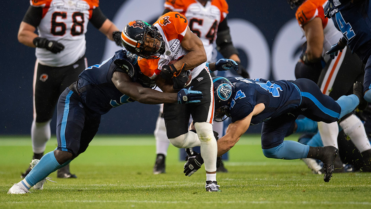
Great picture to illustrate the colours. Look at the numbers, not even close to the right light blue. The helmets are correct and hence do not match the uni’s anymore.
Duran Carter looked ridiculous last game with no socks and his jersey not tucked in. Is he trying to rebel or create his own unique look? He looked like a slob and I agree it’s unprofessional.
-
07-08-2019, 12:41 PM #75Bleeds Double Blue
Achievements:
- Join Date
- Oct 2013
- Location
- At the Tailgate
- Posts
- 5,007
- Points
- 44,706
- Level
- 100
Well the game was in Ottawa and most players were wearing socks... Originally Posted by ArgoGabe22
-
07-08-2019, 02:20 PM #76Bleeds Double Blue
Achievements:
- Join Date
- Nov 2011
- Location
- Section 124, Row 19
- Posts
- 8,803
- Points
- 53,717
- Level
- 100
I don't know how you are determining what the "right" light blue is. The official team colours are Oxford (dark) and Cambridge (light) blue. Whether the team uses the actual pantones for either colour, who knows? There is little doubt, though, that the "light" blue has had many variations in the uniforms over the years. IMO the jerseys introduced in 2012 had the closest we have seen to the actual Cambridge Blue, which has quite a greenish tinge. But the current "Cambridge Blue," however close it is to the pantone, looks just fine to me. Ideally colours should always match between the helmets, jerseys, pants and socks, but there have been countless examples of teams whose jersey colours do not really match their helmet colours. Originally Posted by ArgoZ
As for "Duran" Carter, I agree about the socks. But as for the untucked-in jersey, every single player in the league does not tuck his jersey in. Jerseys haven't been tuckable for years. Some guys just wear them with a sloppier look than others (like Wilder and Carter).Year of the Rocket: John Candy, Wayne Gretzky, a Crooked Tycoon, and the Craziest Season in Football History (https://sutherlandhousebooks.com/pro...of-the-rocket/)
Bouncing Back: From National Joke to Grey Cup Champs (https://bit.ly/3fvip5x)
YOTR YouTube https://bit.ly/37jtG4f
BB YouTube https://bit.ly/2TSYPs7
-
07-08-2019, 06:19 PM #77Bleeds Double Blue
Achievements:
- Join Date
- Dec 2011
- Location
- Ontario
- Posts
- 1,739
- Points
- 13,116
- Level
- 74
^
Your right, the right blue is open to interpretation. I prefer the baby blue that we saw in 91-94, 2007 onwards and the last few years here at BMO (what’s currently on the helmets and what looks like the socks). The jerseys and pants stripe look way off and too dark, almost ultramarine blue. It’s so obvious, it bothers me. I’m surprised many others do not notice.
Carter’s jersey hanged past his bottom. Looking at the above photo, it sure looks like every players jersey is tucked in. That’s news to me that they are shorter. I’ve had numerous game worn jerseys, including Malcolm Williams from last year and there’s no way he didn’t tuck.
-
07-08-2019, 06:22 PM #78Bleeds Double Blue
Achievements:
- Join Date
- Nov 2011
- Location
- Thornhill
- Posts
- 11,841
- Points
- 39,853
- Level
- 100
To me, the jerseys look identical to St Mike’s high school jerseys. I didn’t like the thought of the Cambridge numbers over Oxford jerseys from the vet go as I had a bad feeling it would be hard to read the numbers. Originally Posted by ArgoZ
It's us vs the rest of the country
-
07-08-2019, 06:40 PM #79Bleeds Double Blue
Achievements:
- Join Date
- Nov 2011
- Location
- Section 124, Row 19
- Posts
- 8,803
- Points
- 53,717
- Level
- 100
I think the "Cambridge" Blue used with the 2005-2011 unis was much "bluer" than the greenish version used from 2012 until last season. Originally Posted by ArgoZ
As for the jerseys, I may be wrong about every guy not tucking in, but every single time I have looked closely at this, I've seen nothing but jerseys that are cut to fit snugly at the waist without being tucked in. Check out the images on this page from 2016: http://news.sportslogos.net/2016/05/...across-league/
Malcolm Williams is not tucked in in this image from last season: https://www.ctvnews.ca/sports/argona...onto-1.4004495Year of the Rocket: John Candy, Wayne Gretzky, a Crooked Tycoon, and the Craziest Season in Football History (https://sutherlandhousebooks.com/pro...of-the-rocket/)
Bouncing Back: From National Joke to Grey Cup Champs (https://bit.ly/3fvip5x)
YOTR YouTube https://bit.ly/37jtG4f
BB YouTube https://bit.ly/2TSYPs7
-
07-08-2019, 07:00 PM #80Bleeds Double Blue
Achievements:
- Join Date
- Mar 2013
- Posts
- 7,147
- Points
- 31,773
- Level
- 100
Or MLSE could have just charged the guy the difference between a plain and crested jersey👍 Originally Posted by ArgoZ
Toronto Argonauts
18 Time World Champions
 Reply With Quote


 Posting Permissions
- You may not post new threads
- You may not post replies
- You may not post attachments
- You may not edit your posts
Bookmarks